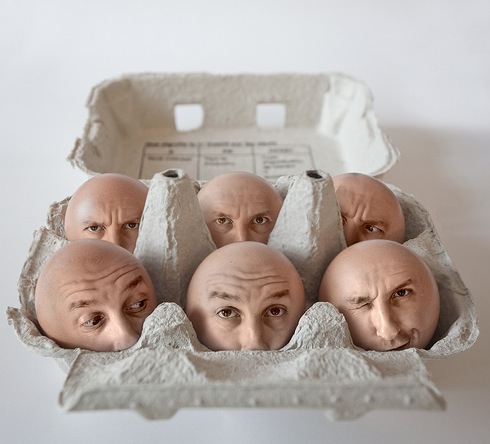
In other words... You may only favor socializing with people with the same interests as yourself, but if you open your mind to new people, you open your mind to new interests and possibilities.
Ello mon, and welcome to mah Blog. Check out my masterful works of art. They are da best.
Wednesday, June 13, 2012
Friday, May 25, 2012
Wednesday, May 16, 2012
The Theme of my book is randomness. Each set of pages has different uses of typography.
I used completely different ways to use typography to show randomness for example, one page is the Death Star made with a random story about the moon and then another page is a Star Trek themed page with huge letters cut up by smaller letters.
Some pages have black on white and others have white on black. Some of them are discolored while others use colored background on vellum paper. I lined up text and lines along with the grid.
The best part of the book in my opinion is the colored vellum pages because it adds color to the bland, black and white text.
Wednesday, May 2, 2012
Progress of typography
This is suppose to look like a bar code, but made out of letters that reads, "Everything has a price".
The theme is lines; man made lines and text vs natural lines and text. For example, man made being bar codes, and natural being zebra stripes.
I may use transitioning of man made to natural lines throughout the book. Man made will look more organized with more numbers and the words used will be technologic words or something, while the natural will be more wavy, disorganized life filled lines with words that describe nature.
So far this is my favorite part. Everything is made out of text and numerals, it may not look so much like a bar code, but it will be improved.
Friday, April 27, 2012
Monday, April 23, 2012
Animation Done
My overall idea of this, is personality. Almost every frame has a different person with a different style of clothing. The camera is focused on the walking, morphing person while the background changes to make it look more like the subject in the view is walking.
I think panning worked really well. without the sidewalks, the person would have less of a walking effect.
I learned how to remove the white background that came with each image of a person so that they fit in easily with the background.
Friday, April 13, 2012
Thursday, April 12, 2012
Tuesday, April 10, 2012
Tuesday, April 3, 2012
Typography
I wanted my words to look depressing but eye catching at the same time. The word TORN should be the most eye catching because of it's black and white contrast and it being in the center of the picture. It is also torn up into pieces to add emphasis to the meaning.
The other 2 words, confused, and lost should be the second most noticeable words on the page. They have much less contrast intensity, but they are surrounded by the contrast effects, making them pop out more.
Probably the most noticeable OBJECT on the page, is the black line to the upper middle of the picture. That should bring out some more words I want you to see like, "Cannot find". It also helps the overall mood of the picture. For all the little text you can barely read, I used coding and then added some words that appear more visible, like "lost" and "404". Words that you may find in the coding should be the things you notice later on.
I started out with just the big typed words, TORN, ConfuseD, and lost, and I tore them out of the paper. I ripped more pieces from the paper to add some detail. After the placement and scanning, I photoshopped it with mostly the sharpen tool all over the page. This gave the intense contrast effect. Then I added the inverted colored lines to help move your eyes where they should be and to fill empty spaces. Finally I added coding from a website, added and modified some words.
One thing I discovered is the invert colors adjustment. That really helps with making things pop out.
This is my Typography project with the theme being Depression. This is before it was shopped.
This is after
Tuesday, March 27, 2012
Folding Project Finished
My theme is the Light and Dark side of a game character "Arthas Menethil". He is a prince who wants to be the best king his kingdom ever had, and to do that, he wanted to power to protect people. He made some errors in his ways of gaining power, and used too much darkness to get that power and slowly turns more evil and becomes the most infamous, hated prince, the Prince of Darkness.
Hopefully the contrast is and folds are good enough to make his 2 faces visible. So, the blue is an image of him when he was the heroic leader figure his kingdom looked up to, and the red image is him after he turns dark and kills his kingdom. If you look closely, you can see the blue face has a promising gentle face with just a little smile, while the red face has really dark creepy eyes and a big grin.
But somewhere on the inside is a mental battle to do GOOD again. It's almost like he has a double personality and fights with himself. The colors seem to be showing that as well.
Awesome Art!
#1
#3
Stairway, by Jean-claude Berens
This picture shows one of my biggest fears, vertigo. Although even though it's scary, it's also really cool looking. The way objects bend more and more into the focal point. The contrast in this image is from the buttom of the stairs haveing the darkest lighting, to the top of the stairs, having the brightest lighting. The movement is shown through the spiral stairs moving up, making the viewer a little dizzy. I looked at a lot of vertigo images like this one and this is the one that really made me feel like I was going to fall backwards on my head.

Jayan Saputra's Passion Fire
Done with photoshop.
This work looks expresses happiness/excitement to me, not just because the girl in the image is smiling, but because the fire she is emitting expresses her feeling of excitment. There is some really good constrast from bright yellow/orange to black. The black background is making making the girl the most dominant part of the image. The fire itself shows movement and the girl swinging he fire hair also shows movement. However there are also embers flying all over the black background which looks like they're flying off of her. In conclusion I believe this image shows excitement through the facial expression and the wild fire hair flowing in the wind, there is a lot of contrast, and movement with the embers and fire hair.
Here is the artist's photoshop tutorial on how to do this. ---> http://psd.tutsplus.com/tutorials/photo-effects-tutorials/flaming-photo-manipulation/
#2 Perrier by, unkown artist (France)
Painting
Perrier is a French corbonated beverage.
The feeling I got from this image is thirst. There isn't too much contrast in this painting, but it does have movement with the Tennis player reaching for the drinks, and everything melting. I also believe that is the reason why this commercial makes me so thirsty, because EVERYTHING, excluding the drinks, is melting.
#3
Stairway, by Jean-claude Berens
This picture shows one of my biggest fears, vertigo. Although even though it's scary, it's also really cool looking. The way objects bend more and more into the focal point. The contrast in this image is from the buttom of the stairs haveing the darkest lighting, to the top of the stairs, having the brightest lighting. The movement is shown through the spiral stairs moving up, making the viewer a little dizzy. I looked at a lot of vertigo images like this one and this is the one that really made me feel like I was going to fall backwards on my head.
#4
Arbeta pa Havet, by Erik Johansson
Photography and retouching
This picture is awesome because the first second I looked at it I noticed the blue ocean and the white clouds, and noticed the person painting the floor blue and that it's not a real ocean. However the Blue standing out from all the grey shades makes it give the illusion that it is an ocean. The way the edge of the blue paint it made, looks like waves, I think that's a cool example of motion.
But this is nothing, he has even cooler stuff. ----> http://alltelleringet.com/portfolio/personal/

#5
() by a French artist Pierre Beteille
()
Thursday, March 22, 2012
Friday, March 16, 2012
Le Ocean
Artwork project made with a bunch of channels.
The overall theme is beauty. Color can show beauty and marine life can be colorful.
Subscribe to:
Comments (Atom)


